Help Me L8ter's payment structure


So, if you want to make money off an application, you need to actually have some sort of payment structure.. Help Me L8ter is no exception. Most apps in the iOS and Play stores follow one of three ways

1: Paid App from store.


Probably the easiest approach, you purchase the app off the store for a one-off payment of some small amount of money.
Pros:
  • Quick guaranteed purchase
  • Code is easy to implement
Cons:
  • Users may not download due to initial payment. No Trial.
  • One time payment

2: Advertising in app

The user downloads the app for free and a small ad is displayed somewhere in
the application.
Pros:
  • Zero cost to user
  • More downloads
  • Ongoing payment to developer
Cons:
  • Clutter in application 

3: In app purchases

The user downloads the application and gets a small trial period. The user can then purchase the application if wanted.
Pros:
  • Easy entry.
  • Ongoing payment to developer
Cons:
  • Additional complexity to user (purchase screen)
  • Additional code


After considering these options, I was leaning towards either Advertising or in-app purchases. I ended up choosing the in-app purchases.
The idea is that you, the user downloads the app. You get 50 "Starts" - that is you can start and stop the timer 50 discreet times. After that has expired, there's a store where you can purchase more starts. I have not fixed the pricing yet but I am imagining an "if you buy more, you pay less" scenario. I also am planning an unlimited option for users.
The implementation on the Setup screen. The Start count is shown on the button.
The shop screen is a fragment attached to the main setup page. You can drag down the page, press the shop button or you will automatically navigate there if you run out of starts
The shop screen, pressing a button will bring up the in app purchase screen

The video might give you a better understanding also.


Notifications

My app, Help Me L8ter uses notifications to remind the user that the application timer is running. Remember, this app sends a "Help Me!" message to people if that timer expires, so it's kind of important that the users see that the app is running.
Great, right? Well no..
Firstly, the icons are scaled badly, not following android's design guidelines for notifications. Secondly, the image could maybe represent the person you are going to notify? Maybe a cool idea. Thirdly, the inbuilt countdown timer is actually a countup timer, so I've got some funky numbers going on there.
Ok, let's fix the icons. So I had a look at the official Google documentation for the status bar icons and it says 32x32 and I had a look and automatically assumed 32x32pixels, instead it's android's device pixels.
So, if you use those standards and populate the mdpi, hdpi xhdpi and xxhdpi folders with the correct sized icons, you start to get nice scaled icons. My icons are straight from the android icon pack, so there's no work for me asides from putting them in the right folders, but if you are doing your own icons, you'll need to scale and save different sized images yourself.
Adding an image was quite straightfoward, I went a little bit more fancy and rounded the image for effect.
As for the countdown timer, well that's a bit tricker. Android provides a built in library for music players and other apps that need a notification that shows how long the notification has been running for.. I want the opposite. I want the app to show me how long is left before an alarm triggers.
Looking at Stackoverflow and other technical sites did not really help that much, so I figured I'd roll my own.

The end result for now. I've got the timer as the message text, the number of people that will be notified in the right text area, and the first person's image in the big icon area.


More UI Improvements

Baby's first UI!
So, Let's take an in-depth look at one widget in my new application, Help Me L8ter. This app is based on a countdown, so I have put a lot of focus in on the timer part of the UI. The app sends SMS messages if this countdown expires, so it's kind of importatant that they can see the countdown and stop or modify it whenever they need to.


Aforementioned Sketch (not bad hey?)
I threw this all together from a sketch up I did in about 2 hours. The sketch covered things like behaviour flow and screen layouts, not really touching on individual widgets. Indicentally NinjaMock is a really nice site.

Mapping an application's behavioural flow is really important, especially when you have more than 1 or 2 screens. The user (and the developer!) need to know where they are, how they got there and how to navigate away.
I made my navigation based on buttons and menu items that take the user to different screens.


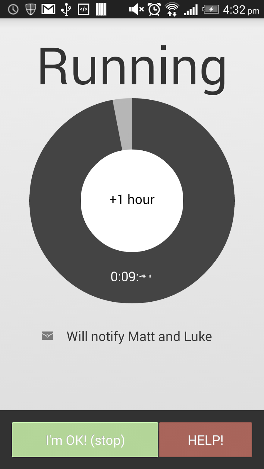
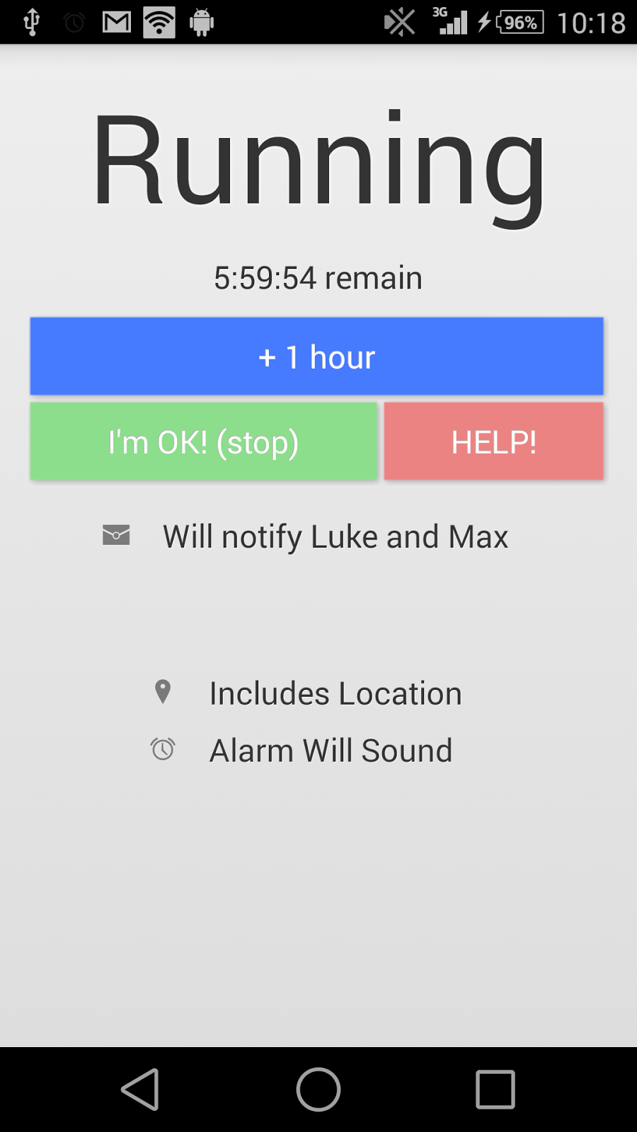
So, great right? I made the screen look like the sketch, but as I said, I did not really touch on the central part of the app, the timer. And also I did not really touch on the navigation properly. The timer (the most important part of the application) was a tiny 12dp bit of font lost in the running screen. I downloaded some libraries and went to work! I ended up with a pie-chart looking timer with a very visual countdown.                                               

Some improvements
Another Issue was the navigation. There were buttons all over the place. I had them in the middle of the screen, at the top, and at the bottom. Very confusing. So I settled on a button bar that's unified on all the screens the user visits.
Users want to know what the time left is. And I want them to be wowed about the experience.
 
Now we are on to something! A few libraries and a few modifications and we've got ourselves a large countdown wheel with some other goodies. The button in the middle adds one hour, the time and the percentage of the wheel give good information to the user by either glancing at the app or taking a more detailed look.. But the button in the middle? and the appearance.. hmm.

Ok, well the rest of the app is using subtle shading throughout giving the appearance of overhead lighting and a bit of occlusion (look it up!), for example
Shading in the rest of the app
All this screen, you can see the text shadows indicate etched text with an overhead light, and there is a little shadow around the white card boxes where the user makes input. Oh you cant see? Let me show you!
This is zoomed in a bit. See the white lines around the text? That, when zoomed out makes the text look subtly etched. It's small details that make an app great. Next time you use GMail, Facebook or Twitter, have a look at the small details like this.. you'll be suprised! Ok so back the the countdown timer!
So after a few hours I made some subtle light changes to the timer.


"Finished" product

The shading makes the time arc look like it's dug into the background slightly, blending the whole thing in a bit more with the rest of the app.. The key here is subtle. You can really easily go right over the top with this stuff and while you put a lot of effort in you can end up with an app that looks utterly horrid. While I wont provide examples of bad Apps, you can find plenty on your own in the play store. You've probably got a few installed!

Improving the UI

So, I have been working on the UI of my new app, Help Me L8ter and some extra spice really does make a huge difference to an application.
Have a look at a couple of before and after shots.


It's funny how little things like tidying up text and replacing with icons and adding nice looking widgets can help.

Help Me L8ter

So, I am writing another app...

This time it's for much broader target audience that I think need something like this. It's a Dead man's timer that broadcasts a cry for help if the timer is not incremented or stopped. It's a rather simple concept with far reaching options.
  • You are walking home from a bar late at night and are worried about who you meet on the street on the way home.
  • You are paragliding in your local site and your buddies have already left, making you the last on the hill.
  • You are a photojournalist in a hostile city. You are worried about being kidnapped.
  • You are rock climbing.

Well, you can just flick this app on, set a couple of buddies to notify, set a time that you are planning on being out for, and start! If you end up OK, that's great, If you end up pinned under a boulder rock-climbing and you cant reach your phone, great! Your phone will automatically notify the buddies you chose with your location and a small "Help Me!" message.


Simple concept right?


Well, no.. it's not that easy. You've got to deal with the limitations of Cell coverage, GPS accuracy, and a myriad of other things. along with coding for UX design. But I've almost finished.

Anyway, I'm quite a long way along now and almost have an app ready to test.  Send me an email or PM and I'll send you an APK to test if you are keen.

A few caveats:
  • I wrote this app, some of you know me right? It's also a BETA. It also sends text messages to people calling for help.. Be prepared to forewarn people if you are going to test this.
  • It sends text messages.. I know I mentioned this before.. but these things cost money sometimes.
  • Some of the UI elements might look strange on older phones. Please tell me if they do! I've only got one phone, and the android emulator is not the best sometimes. 
  • Android only. Sorry iOS users.